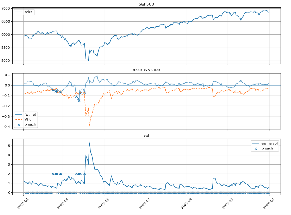
Task 3. VaR Backtesting
VaR Backtesting
- most of the time, we assume daily return follow normal distribution and as the question say, Var is caculated at 99% confidence.
Import Libraries
| |
| |
| |
| |
| |
Load Data
| |
| |
Data Operation
| |
| |
(a) VaR Breach Statistics
| |
| |
(b) Visualization
Plot showing VaR breaches (marked with crosses)
| |
(c) Traffic-Light Zones
| |
| |
| |
| |
| |
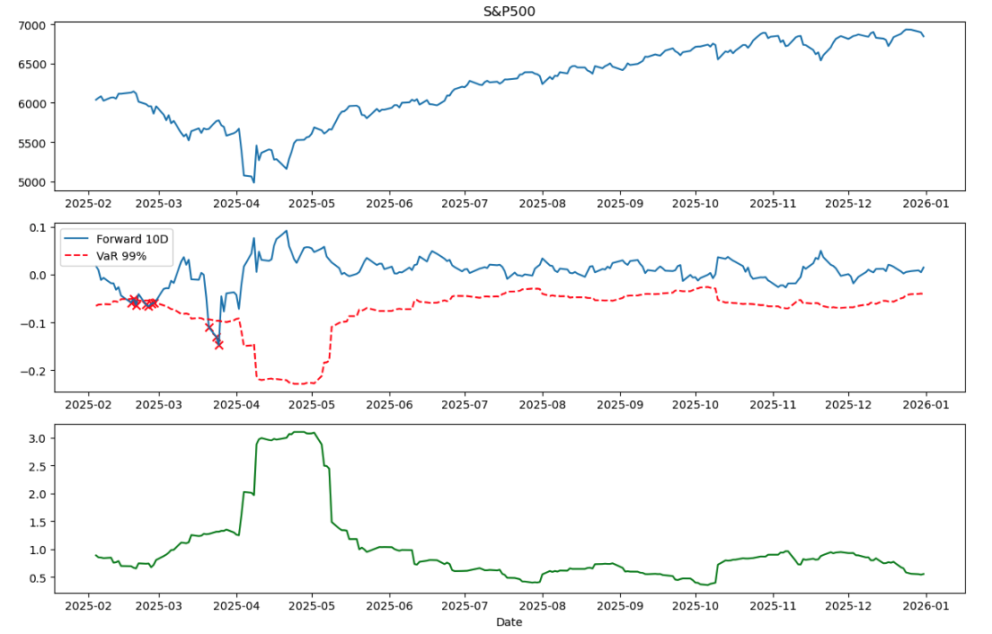
Task 4. EWMA Volatility Forecast for VaR Backtesting
Task 4: EWMA Volatility Forecast for VaR Backtesting
- 99% VaR, 10-day horizon, normal assumption
Import Libraries
| |
| |
| |
Load Data
| |
| |
Data Preprocessing
| |
| |
(a) VaR Breach Statistics
| |
| |
Traffic-Light Zones
| |
| |
(b) Visualization
Plot showing VaR breaches (marked with crosses)
| |
| |
(c) Comparison of Three Approaches
As discussed in the lecture, we know the pros and cons of these three method.
- Historical Simulation: Does not depend on distributional assumptions; can capture heavy tails; But the rolling window length is a critical factor.
- Rolling SD: Provides stable estimates but is slow to adapt to structural changes in volatility.
- EWMA: Responds quickly to new information, but the results depend on the decay factor λ.
What figure above tell us:
- common part: the breach events in Figure 2 clearly cluster during the market downturn visible in Figure 1 (around March-April 2025),This pattern confirms that all three methods respond to heightened market risk, but with different speeds.
- Rolling SD the Rolling SD method (which I implemented in Task 3) responded more slowly. I observed that when extreme returns exited the 21-day window around late March, the volatility estimate dropped suddenly—giving a false sense of calm
- Historical Simulation would face a similar lag: it needs extreme returns to enter AND fill the window before risk estimates fully adjust, typically requiring 2-3 weeks.
- EWMA My volatility plot (Figure 3) shows EWMA volatility jumping from about 1% to over 5% during the April 2025 stress period, offers the best adaptability for risk management during stress periods, despite its normal distribution assumption. Rolling SD sits awkwardly in the middle—slower than EWMA but without the distribution-free benefit of Historical Simulation
From my opinion:
When choosing a method for risk management, the decision depends on the use case:
- For real-time risk monitoring during volatile periods, EWMA is preferable due to its fast response.
- For regulatory reporting where stability matters, Historical Simulation might be more appropriate.
- Rolling SD, while conceptually simple, offers limited advantages in either scenario.